Try a splash of gorgeous color to boost curb appeal and make your front entry more welcoming.
Related To:
Related To:
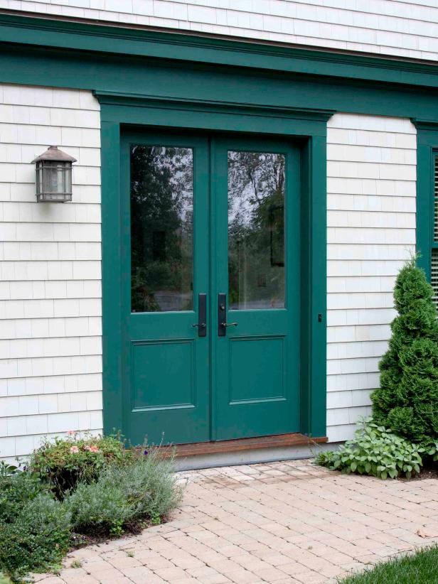
Green Light
According to Feng Shui principles, you can’t go wrong with green, the color of balance and renewal. Don’t worry that it will blend in with your landscaping — using green can actually draw out the different shades that are found naturally in your yard. The saturated hue shown is Behr’s Precious Emerald.
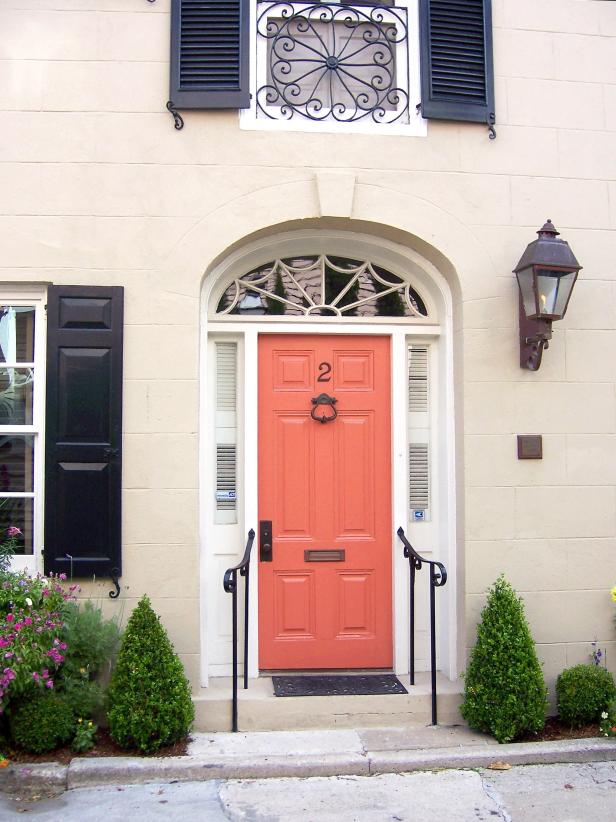
Unique Coral
You might think coral pink would be a tough color to pull off, but it looks right at home paired with a pale cream brick. Photographer and licensed contractor Brittany Bailey loves unique front door colors, which is why she photographed this pinkish-orange door, which is a good companion for any neutral siding color.
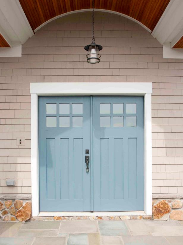
Easy on the Eyes
This cool grayish-blue (Behr’s Oslo Blue) makes a great complementary pairing with the warm neutral palette of the surrounding house. The color also echoes the soft blues on the stone porch.
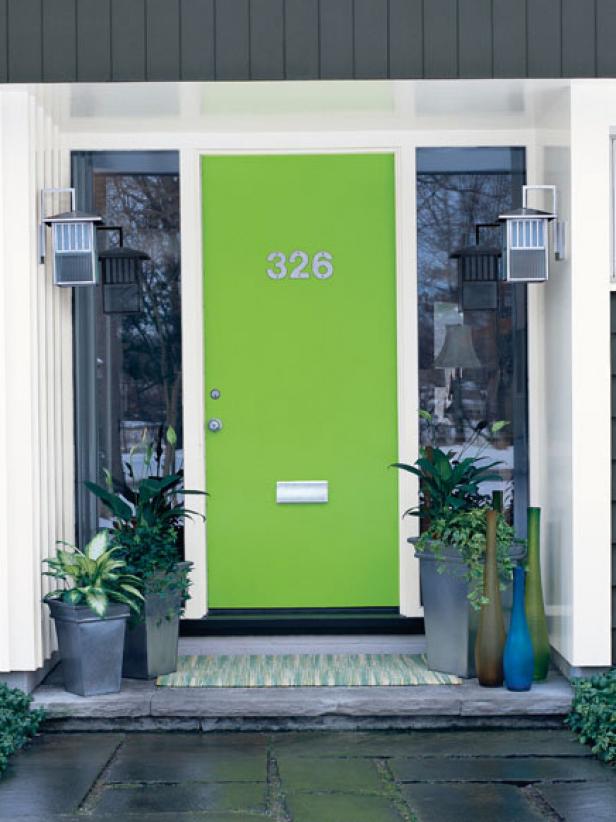
A Slice of Lime
It’s hard to resist painting a contemporary door a vibrant shade, like this delicious Overt Green by Sherwin-Williams. The simplicity of the door — which isn’t interrupted with panels, windows or other details — acts as a great blank canvas to apply a bold citrusy color.
Grape Expectations
DIY blogger Brittany Bailey (prettyhandygirl.com) knows a thing or two about home improvement, but for this project, she didn’t have to lift a finger. She inherited this purple front door from the previous owners of her home and decided to keep it as is. The color, unique to Bailey’s neighborhood, pops against white trim and also picks up the color in the mosaic tile on the brick porch.
Spicing Things Up
A photo in a magazine inspired decor blogger Korrie Bastian (redhenhome.blogspot.com) to paint her front door a warm orange. The tasty pumpkin-pie color is Behr’s Maple Leaf.
Cool Turquoise
Inspired by an antique cabinet she saw, Beyond the Screen Door blogger and designer Sonya Hamilton painted her own front door a brilliant blue-green and applied a glaze to get an antique effect. This color is Sherwin-Williams Nifty Turquoise.
Raisin Purple
This earthy color palette is warm and inviting, but it’s the brownish-purple front door that really makes it happen. Use Sherwin Williams’ Raisin to pull off this look.
Elegant Indigo
A Victorian home is a license to indulge in brilliant paint and trim choices. “This style of architecture has so much detail that it takes a dark or bold color to draw your attention to the front door as a focal point,” says Jackie Jordan, Director of Color Marketing for Sherwin-Williams. This shade, Sherwin-Williams Indigo, harmonizes with the copper trim above and the brass hardware and kickplate below.
Cheerful Yellow
If your home’s traditional exterior needs a boost of style, spruce it up with a sunny yellow front door. Try Behr’s Solar Energy to add that beautiful dose of curb appeal.
Sea Blue
A saturated shade of blue accentuates the gorgeous elliptical door and adds a shot of personality to this traditional two-toned house. The paint color shown is Sherwin-Williams’ Regatta.
Energetic Orange
The color orange is associated with vibrant energy, according to award-winning designer Lori Dennis, ASID. For that reason, orange can be hard to pull off — but pairing it with a cool gray exterior keeps the mood balanced and bright.
Elegant Navy
This traditional front door is painted deep navy — Behr’s Deep Breath — to complement the slate-gray wood-shingle siding and white trim.
Muted Oak
If you have a Craftsman-style home, you’ll want the intricate architectural details to stand out. With a rich wood color like Sherwin-Williams’ Cut the Mustard, your front door will complement your home’s design instead of taking away the spotlight.
Soft Grape
Purple is a dual-meaning color: It can be thought of as regal and sophisticated as well as groovy and whimsical. This purple door is both. It’s classy and elegant and totally hip at the same time. Image courtesy of Behr.
Nature’s Tones
Many Victorian homes showcase an explosion of colors in their exterior paint schemes. Not your style? Keep it soothing and simple with muted siding and a natural door color like Behr’s Royal Liqueur.
Statley Red
The strong ocean blue trim and bright red door complement the historic feel of this home without imparting an ounce of stuffiness. Image courtesy of Behr.
Tone-on-Tone
Your front door color doesn’t have to be high-contrast to be beautiful, especially if your house is already a distinctive color. This door — painted in Behr’s Tuscany Hillside — deepens the effect of the green siding without making the look too busy.
Black Ink
There’s just something about a glossy black door — it’s elegant, bold and impossible to ignore. But it makes an even bigger statement with the right trim. Here, the black entrance door of this historic home is enhanced with accents of olive green, cream and red. Image courtesy of Behr Paints.
Sky Blue
This sky-blue door paired with a cloud gray roof is a great way to add some color to a traditional white colonial home. This fun hue is Benjamin Moore’s Cool Blue.
Minty Fresh
This confection of a front door was snapped by DIY blogger Brittany Bailey (prettyhandygirl.com) on a neighborhood stroll. The pale Jordan-almond color is a close match, she suggests, for the Sherwin-Williams shade Aqua Tint.
Rustic Red
This eye-catching traditional exterior is rooted in its landscape with an earthy palette. The rustic red door and matching shutters stand out against the muted hues, bringing a warm, sun-baked look to this home. Try Sherwin-Williams’ Rustic Red to pull this look together.
Bold Blue
Got a stodgy brick facade on your hands? An electric-blue front door will certainly breathe some life into the picture — and knock your neighbors’ socks off. DIY blogger Brittany Bailey (prettyhandygirl.com) spotted this one on vacation in the United Kingdom.
Put It in Neutral
If your house has a neutral color palette and you’re squeamish about bright hues — not everyone can handle a candy-apple red or a neon green front door — try a paint color that is also neutral but has the opposite “temperature.” That is, choose a warm door to go with a cool house or vice versa. Here, taupe siding with warm yellow undertones is nicely complemented by a charcoal gray with a cool-bluish tone.
Radiant Red
There’s nothing like a traditional white, country home with a large porch. A radiant red front door (Benjamin Moore’s Caliente) provides a fun dose of personality with a modern twist.
Butter Yellow
This home takes a cue from its woodland setting with a cool color palette. The pastel yellow door (Behr’s Marsh Marigold) adds a warm and welcoming feel without taking away from the calm and serene vibe.
“M” Is for “Marvelous”
If you’re going to paint your front door, why not go all out? Lifestyle blogger Jill McKee, who dishes on DIY home decor at meandjilly.blogspot.com, gave her door a much-needed makeover with a strip of crown molding and a can of Benjamin Moore’s Iron Mountain. Then she took it up a notch by painting a houndstooth pattern on a papier-mache “M” in a lighter shade of gray, distressing it with sandpaper and attaching it to the door to achieve the final look.
Eye Candy
Everybody knows and loves the classic red front door — but the shade people usually pick is cranberry, which has blue undertones. To turn the temperature up a notch, push your red towards orange instead. As shown here, it makes a totally unexpected but satisfying pairing with the weathered brick.
Powder Blue Meets Stripes
Blogger Ellen Mallernee Barnes (blackandwhiteandlovedallover.com) got so inspired while she was painting her front door blue — that’s Benjamin Moore’s Wythe Blue — that she decided to go all out with porch stripes. Those colors are from Sherwin-Williams’ Perfect Greige and Antique Ivory. “It turned out so fun and bright,” Barnes says. “I love pulling into my driveway now.”
Blush Red
This blush-red door stands out against the neat, clean look of the creamy white trim and sage green siding. Sherwin Williams’ Flower Pot was used on the door for contrast.
Dark Chocolate
High-contrast landscapes call for high-contrast color palettes. This desert ranch stays cool with a white exterior and an accent of chocolate brown trim and door. The beauty of this color combo? Any accent color can be chosen for outdoor furniture and decorations. Use Behr’s Divine Wine to achieve this look.
Blue Lake
Spruce up a modern home by painting the front door and the porch similar colors in the same color family. Here, Benjamin Moore’s Blue Lake door works perfectly with the grayish blue floor and dark brown trim.
Candy Red
A red front door may seem awfully dramatic when you’re looking at paint swatches, but don’t fear it. Red is such a popular way to add interest to a neutral exterior that it’s now considered a classic choice. This shade, Behr’s Licorice Stick, is a source of energy and an instant cure for “the taupes.”
Sunny Yellow
Cass, blogger from That Old House, describes the hue of her front door as “summer squash yellow.” It’s actually Benjamin Moore’s Imperial Yellow, which pops out like a happy surprise from behind the charcoal-colored screen door frame and trim.
Cotton White
Make the entrance of your home stand out from its surroundings by keeping it neutral. This traditional home’s soft pine-green base pops with an accent of sky blue and an understated creamy white door (Behr’s Twinkling Lights).
One of a Kind
Interior designer Lucy Williams paired one of her clients with a custom millwork company to build this fabulous wood door. The intense turquoise color makes a strong statement against the soft-yellow brick, especially flanked by mirror-backed lanterns.
The Flip Side
Don’t be afraid to commit to a front door color just because it won’t work in your living room! The turquoise door shown in the previous photo was painted white on the reverse side to keep the foyer calm and neutral.
Eye-Catching Cinnamon
A modern beach house warms in the sun with its custard-yellow siding and a cinnamon-stick front door (Behr’s Artisan). Pure white accents on the windows contribute to the crisp and clean vibe.
Classic Red
You can’t miss with a blue-toned red, which is so ubiquitous it’s practically a neutral these days. Shown is Behr’s Morocco Red — it’s like a cherry on top of the vanilla siding sundae.
Burst of Sunshine
You just can’t sustain a bad mood in the presence of a bright yellow door. This one, which belongs to blogger Erin Loechner, is set off by charcoal-gray shake siding and a decal applied to the glass sidelight that says sweetly, “Hello.”
Accents for Blending
When you add a reddish-brown front door to a Spanish-style stucco home, you make a statement while at the same time allowing the accent color to elegantly blend in with its surroundings. Sherwin Williams’ Cavern Clay is shown here.
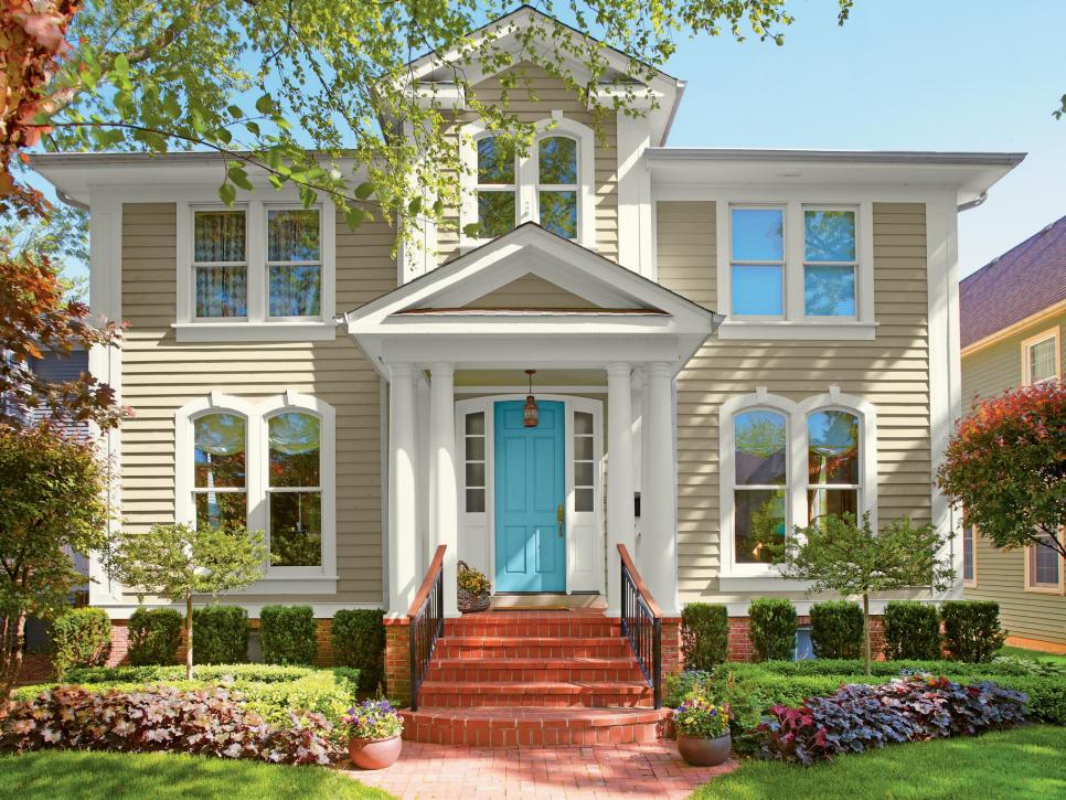
Photo By: Valspar
©Behr
©Brittany Bailey
©Behr
Advertisement
Bright Blue
Symmetrical homes evoke a sense of formality, elegance and heritage. This blue door spotlights the architecture so the siding doesn’t completely fade into its surroundings. Use Valspar’s Lake Breeze to achieve this blue beauty.


