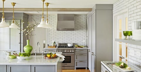
Open shelving is going to change your life—trust us.
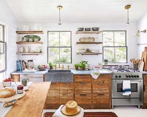
You don’t have to go nuts to achieve an on-trend kitchen. While an apron-front sink in a farmhouse kitchen isn’t exactly unexpected, a farmhouse sink in soapstone with brass hardware is a showstopper—especially when it’s set against white walls, wood cabinets, and stainless steel countertops.

For those who fear color, focus on mixing up the finishes. Designer Cathy Chapman chose white beadboard on the ceiling and shiplap for the walls. She used unlacquered brass strap hinges and latches on the cabinets, black marble on the island countertop, and tons of warm woods on the floors, backsplash, and remaining countertops.
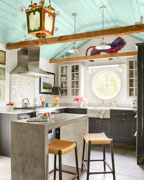
When you want to maintain neutrality but still have some fun in the kitchen, shoot for the stars—or in this case, the ceiling. Here, the Madcap Cottage team chose to paint the ceiling a Southern porch-inspired blue (Blue Ground by Farrow & Ball) and added an elaborate antique lantern.
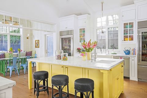
You don’t have to scrap an all-white kitchen to stay on trend. Dip your toe in the color pool instead, whether you store colorful pottery in glass-front cabinets, bring in colorful furniture, or paint a large piece like this kitchen island in Tropical Moss by Dunn-Edwards Paints.
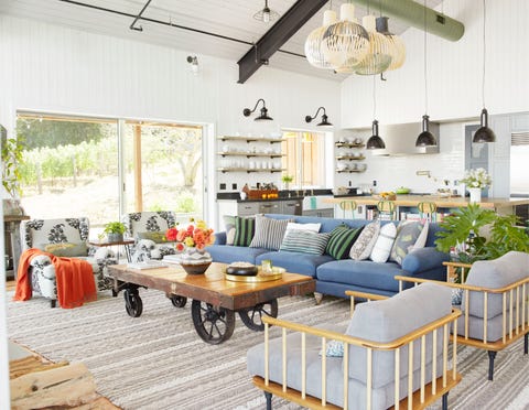
Maximize living space by making the family room and kitchen one large room. A mix of lighting helps differentiate the areas, while a uniform wall color keeps everything cohesive.
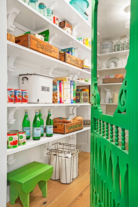
Gone are the days of having a dark little pantry to house dry goods hidden away from prying eyes. Today’s kitchens boast roomy pantries with shelving aplenty for your cereals and collectibles. Proud of your organizational skills and want to show off? Finish the pantry space with a screened porch door painted in an eye-catching color, like this bright green hue.

Appliance makers like Lacanche, Big Chill, and Smeg offer up a host of practical pieces in a number of colors and finishes, which will definitely liven up your range.
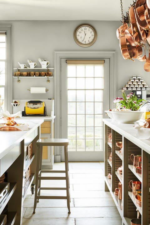
If there’s one person who knows her way around a kitchen, it’s Martha Stewart. Her cooking area features copper pots and pans with an impressive collection of matching servingware.
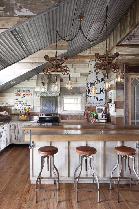
To us, vintage will always be in. The owners of this Texas farmhouse show their love of repurposed pieces with matching reclaimed pine throughout the home.
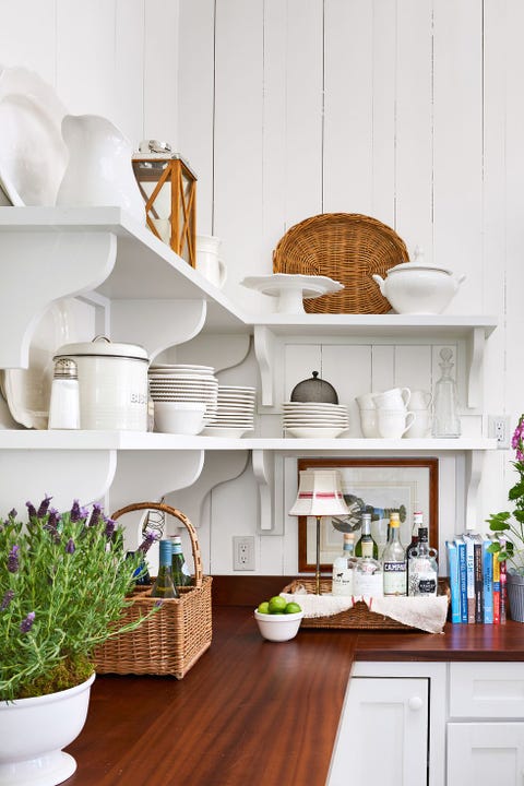
In this Massachusetts beach house, a savvy couple replaced linoleum with warm wood for a durable upgrade. Butcher block is virtually maintenance-free—it just needs an occasional coating of mineral oil—and the natural material is the perfect neutral to break up the sterility of an all-white palette.
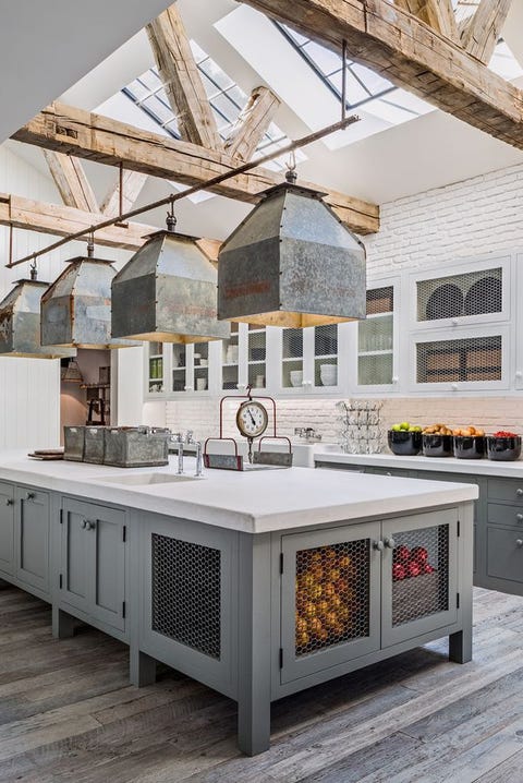
Feel free to mix it up: Unified cabinetry is a thing of the past. Here, Diane Keaton features contrasting white and gray storage in her beautifully rustic kitchen.
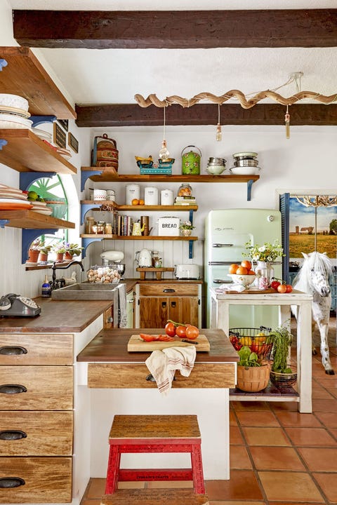
With stainless steel on the way out, color is making a big comeback. Take a cue from this homeowner’s lively kitchen, which features a retro-inspired mint greenrefrigerator and dishwasher, plus a series of Smeg countertop appliances.

If you feel inclined to give more attention to your appliances, backsplash, or accessories, then you’re going to be the first to embrace this new trend. Let your other kitchen elements steal the show with a sleek and minimalistic range hood like this onefashioned to blend in with the former chicken coop cabinets.
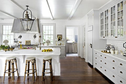
If you choose a light paint for walls or cabinetry, select a dark floor stain to up the cozy factor of the room. Mix one-half Ebony and one-half Jacobean from Minwax.
Bonus idea: The addition of furniture-like “feet” gives cabinetry a softer, more custom feel.
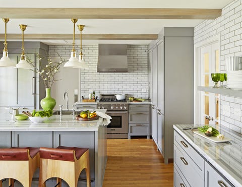
Gray undertones lend a timeless, totally livable vibe to most paint colors—not just beige—whether it’s a sophisticated blue-gray seen in this photo (Oyster Bay by Sherwin-Williams), a purple-gray (like Grayish by Sherwin-Williams), or green-gray (like Dry Sage by Benjamin Moore).
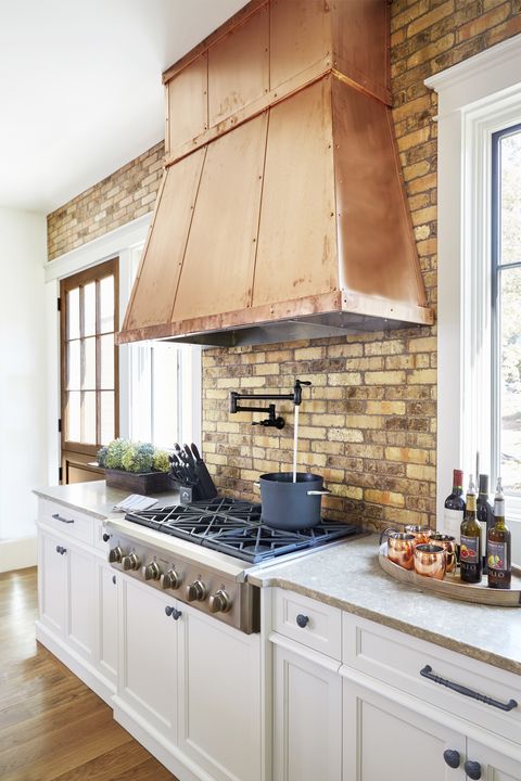
The open shelving trend isn’t going anywhere, and in a kitchen void of upper cabinetry, the hood is inevitably the centerpiece. Dress it accordingly! Copper sheeting, with coordinating straps and rivets, adds age-old warmth.
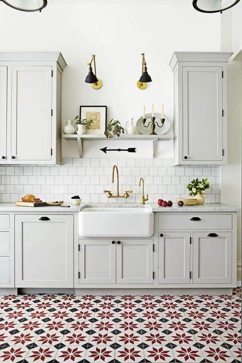
Rugs, however durable, aren’t practical for a heavy-use kitchen. Enter statement floor tile. It’s a more subtle way to add impact than, say, a bold eye-level backsplash.
Bonus idea: Tired of the same old subway tile? This on-trend square shape has a charming shingle-like effect.
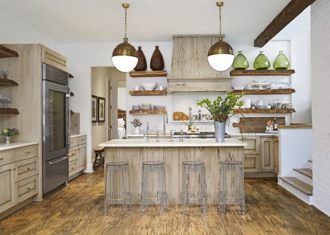
If you can’t get enough of the reclaimed-wood look, here are two words you’ll be hearing a lot: pecky cypress. Seen here on the hood and island, it’s a type of wood that has a grainy texture thanks to long, narrow burrows or cavities.
Bonus idea: From boxy appliances and islands to linear shelves, kitchens tend to have a lot of straight lines. Soften the room with orb lights.
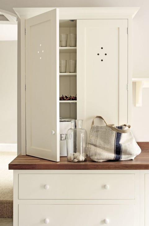
The (addictive!) Instagram feed of Britain’s deVOL kitchens offers an endless stream of age-old English inspiration, from decorative “spot cutouts” to painted wooden knobs. Take a cue from the kitchen experts and hide modern appliances such as microwaves in cabinetry that runs flush with the countertops.

Open shelves allow you to showcase your beautiful kitchenwares among other heirlooms and antiques, as well as statement wallpaper like in this kitchen design. The ability to see through your storage also means everything is easy to find.
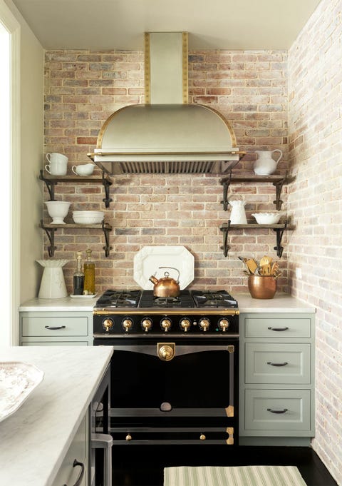
Plain old stainless steel has its merits, but in a small kitchen, a giant swath of silvery metal can quickly dominate the room. Appliance manufacturers such as GE, Samsung, and Whirlpool have wised up to this dilemma, introducing refrigerators, stoves, and microwaves in sophisticated shades of black and slate. We’re particularly fond of the new LG “Black Stainless Steel” series, a collaboration with designer Nate Berkus.
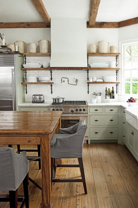
The kitchen is the most utilitarian room in the house, which is why you obsess over the appliances, the backsplash, the sink…But it’s also the heart of the home. Subtle touches such as slipcovers, decorative hardware, and prized collections serve up a little softness.
Bonus idea: Save the top shelf for precious collectibles, and leave the lower ones to everyday items.
