Bold, saturated colors are back after years of calm beiges, soothing grays, and varied whites dominating the interior design scene. What’s a homeowner to do?
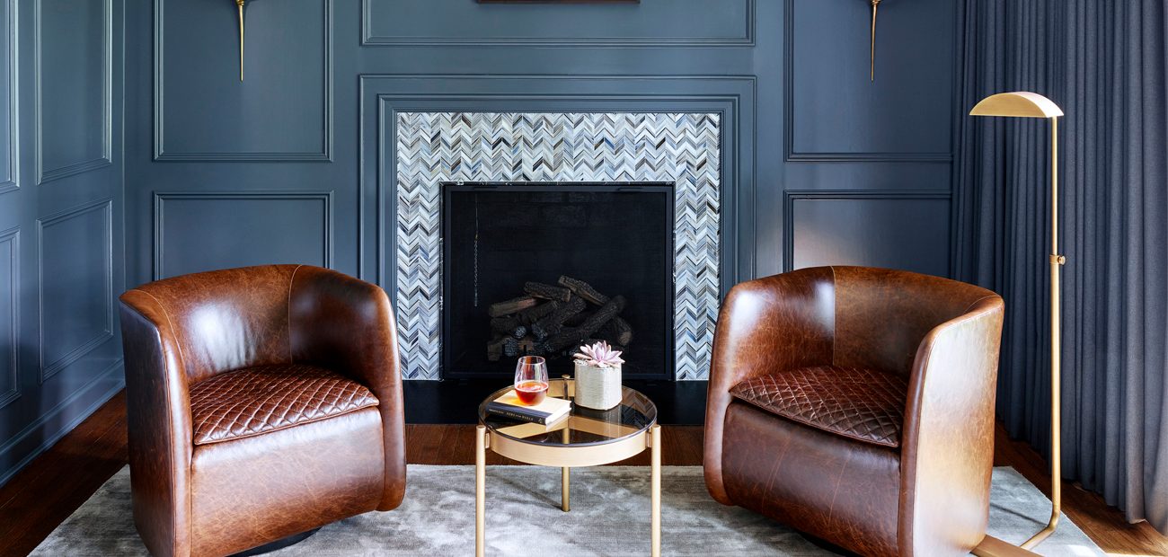
© Michael Robinson / Morgante Wilson Architects
For years, homeowners and their real estate professionals have walked a fine line between current interior trends and choosing a neutral palette that attracts the most potential buyers. If a homeowner went with rich color choices in paint and other decor, they risked paying a price at the time of resale. A glossy red dining room or purple wallpapered bedroom may even have turned away potential buyers.
But as design trends have evolved once again, that safe route of neutral beiges, grays, and whites has led to a sameness that’s a bit tiresome. When the country’s most famous color trendsetter, Pantone, and several other paint manufacturers announced that their 2020 color of the year choices were royal and navy blues, dusty pink, and multiple variations of green, many homeowners have jumped on the vibrant color bandwagon.
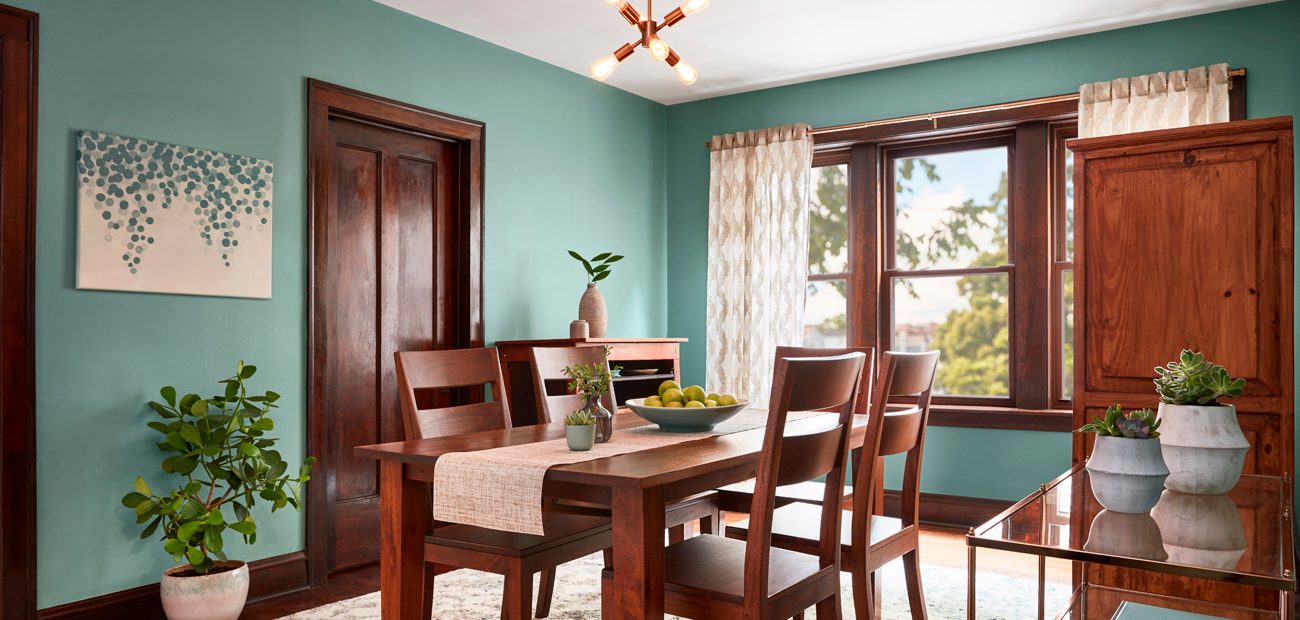
© Valspar
The choices represented a collective yearning for greater personalization happening throughout the fashion and design worlds. New York–based designer Gideon Mendelson, whose Mendelson Group is known for embracing color, recently completed a yellow kitchen for a client’s weekend home. “She’s very bubbly and energetic and likes the idea of the more colors the merrier,” he says. And Montclair, N.J., color expert Amy Wax, who helps homeowners choose palettes, finds that strong colors can make a home more memorable for its owners and would-be buyers.
Yet, a conundrum remains for those who aren’t convinced about going bold. There is still a legitimate worry that many buyers will be turned off despite the new colors’ trendiness. So, is it better to use large expanses of vibrant hues in ways that are complimentary? Or should homeowners stick with the neutrals and add a few bold accents here and there? Here are tips to help your clients navigate 2020’s complex color landscape.
What’s Trending
Homeowners should approach the new, bolder interior design colors as inspiration rather than palettes to slavishly imitate throughout a home. “The trends are more for HGTV designers and to provide ideas rather than have everyone follow them exactly,” says Mendelson.
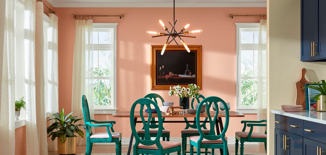
© Sherwin-Williams
Though it may seem like one color dominates each year—especially since Pantone Color Institute introduced its color of the year concept more than 20 years ago—that’s not necessarily the case. The color of the year represents a clever way to influence design choices and market paint products. After Pantone, other paint and color manufacturers hopped on the bandwagon.
This year is no different. Sherwin-Williams and Pantone each debuted deep yet different blues. Blue already has become an emerging color trend in kitchen cabinets. Colorful appliances are also growing in popularity. While they’re not replacing the more pervasive stainless steel and white appliances, more companies are offering colorful options for refrigerators, ranges, and dishwashers.
Benjamin Moore came out with a dusty rose pink color of the year, Behr and Dunn-Edwards touted greens, and Dacor took it a step further with its DacorMatch Color system, which permits homeowners to have their favorite color swatch copied for their appliances. The Big Chill, a vintage-inspired appliance company, offers a range of retro hues—think yellow, pink, and turquoise.
Neutrals Are Still Important
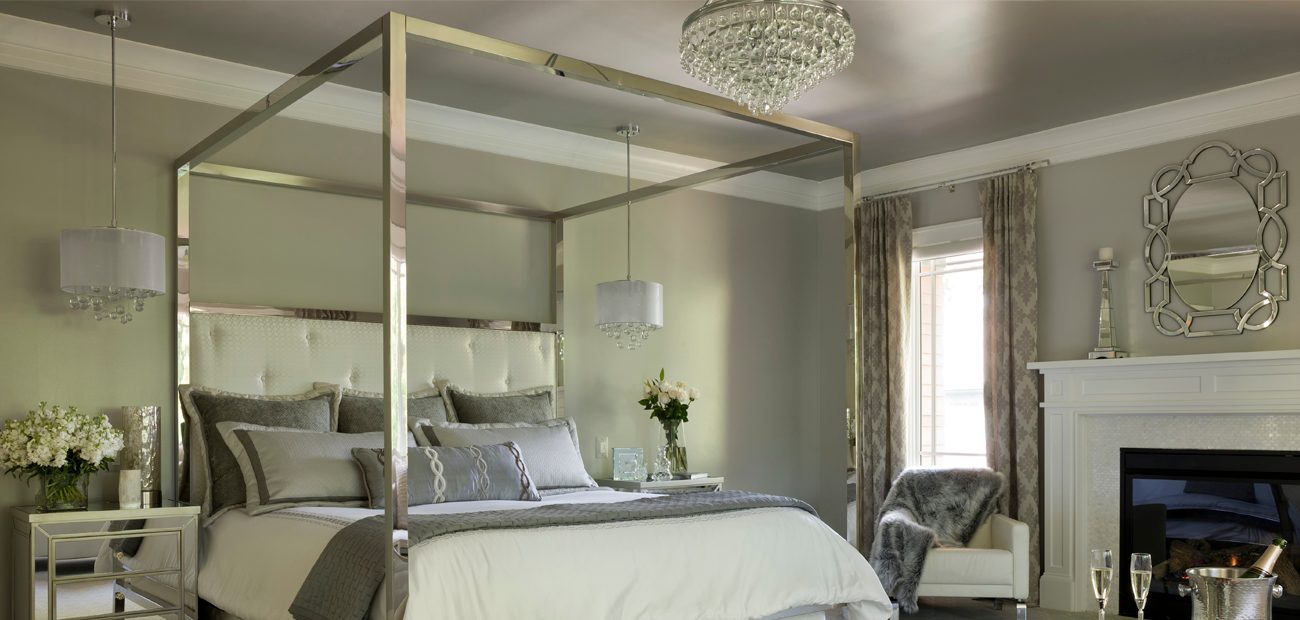
© Beall Photography / Sharon McCormick Design
While bold colors get all the buzz, grays, beiges, and whites aren’t disappearing completely. “They’re classics,” says designer and blogger Laurel Bern of Laurel Bern Interiors. Neutrals will continue to show up in interiors, especially in the kitchen, according to the 2020 Houzz Kitchen Trends Study findings. White continues to be the most popular cabinet color, followed by medium wood, then gray. And neutral grays, whites, and beiges are still highly popular on walls and throughout interiors.
Designer Sharon Gosselin McCormick of Sharon McCormick Design in Hartford, Conn., says her clients still request neutrals. And Tina Nokes, owner of Five Star Painting in Loudoun, Va., uses the new colors of the year in showhouses to educate clients about the latest trends, but most of her interior jobs involve neutral colors.
In some instances, white could be seen as one of the bold color trends of 2020. Jennifer Ames, sales agent with of Engel & Volkers in Chicago, says she’s seeing more homeowners favor white than previously. “It has a very modern, gallery-esque look and is so flexible with decorating choices,” she says. Julia Buckingham, founder of Julia Buckingham Interiors and the shop Modernique in Phoenix, concurs on white’s popularity. “It offers a blank slate and is great for all the colorful art that’s popular,” she says.
Pairing Neutrals With Bold Colors
© Sherwin-Williams
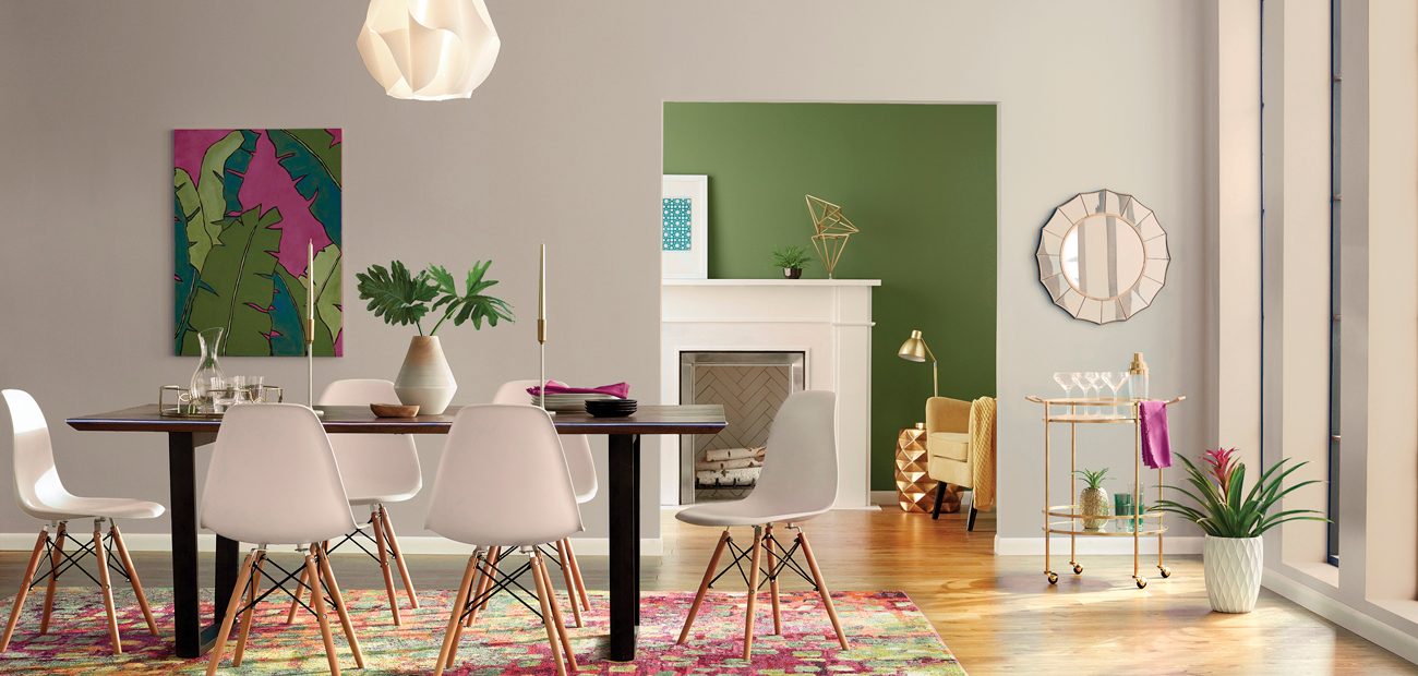
The biggest takeaway from this year’s interior trends is that neutrals are more frequently being paired with pops of stronger colors. Some of the neutral paint colors even have a hint of underlying tones to offer a happy middle ground and some freshness. This is the approach that The Spruce, a home and lifestyle website out of Stroudsburg, Pa., is taking with its new interior paint line. “We think grays and beiges will always have staying power, but our paints have hints of colorful undertones,” says Melanie Berniet, the company’s general manager. “They’re less traditional than beige or gray and feel a bit more modern but aren’t too experimental.”
Valspar also went this direction with its 12 colors of the year. Inspired by nature, the palette includes an array of dusty, muted hues that are subtle and highly livable, says Sue Kim, the company’s color marketing manager.
Advise Clients to Choose What Speaks to Them
© Amy Wax
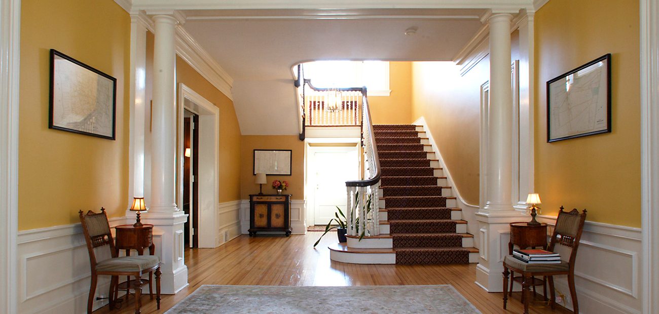
Ultimately, homeowners should go with that makes them feel good rather than what’s trending, says Chicago designer Rebecca Pogonitz of GoGo Design Group—that’s what will give their space its “soul.”
Mendelson helps his clients find the right colors by asking them a series of questions, such as, “What colors make you feel comfortable?” Bern also recommends taking the size of the room, how it’s lit, and its intended use into consideration. If the answers point toward a bolder hue, but homeowners seem hesitant, then recommend testing the waters in smaller doses.
© Kyle Caldwell / Sharon McCormick Design
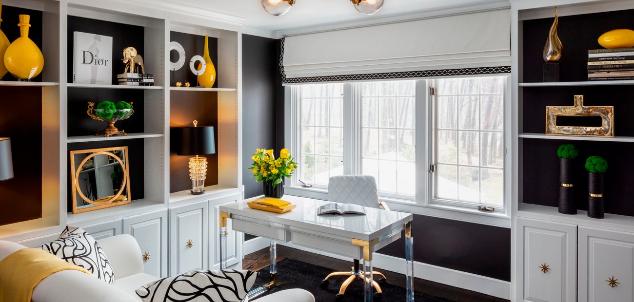
Elissa Morgante, co-founder of Morgante Wilson Architects in Chicago, suggests that clients initially choose just one accent wall to try a big bolder color. “Powder rooms are a fun place to experiment with an intense shade,” she says. Berliet also recommends experimenting with pops of color in heavily trafficked rooms, such as the kitchen, but in unexpected places, such as inside cabinetry and drawers.
Another way to introduce bold hues is through pillows and other soft features against a neutral background, says Kristie Barnett, founder of the Decorologist design firm in Nashville, which trains stagers and color experts. The benefit is that they’re easy to switch out.
If homeowners have their heart set on painting, they can always take one of the newer bold colors and mute it by mixing with a gray or white paint, says Mendelson. And for those confident about taking the plunge, the end results can be rewarding. “I’ve painted a few dining rooms for clients who wanted them black—another trend—and used white trim, and it turned out dramatic, crisp, and beautiful,” Nokes says.
Repaint if You Must

© Eric Piasecki / Mendelson Group
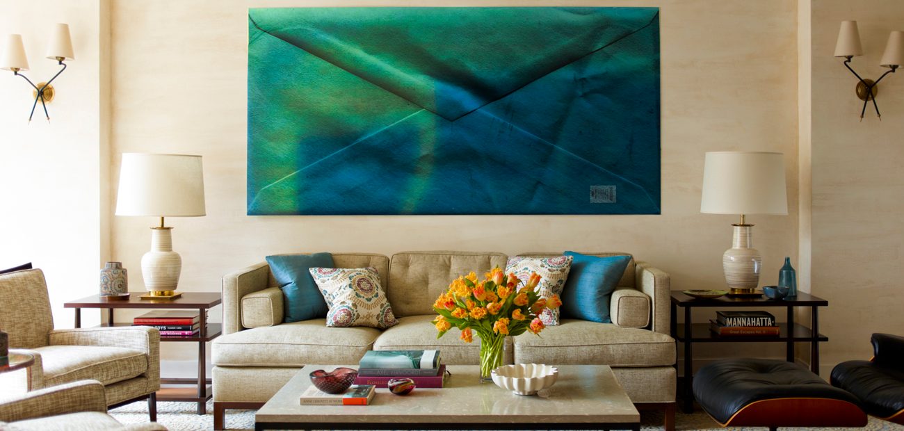
Ask your buyers how many years they plan to be in their home. While nobody knows for certain, some buyers have a rough idea. If it’s fewer than five years, and definitely less than three, they might consider using more universally appealing neutrals for walls and permanent features, such as cabinets and countertops. They can save the bolder new colors for accessories, art, or accents, “just not everywhere,” says McCormick.
For those who think they’ll stay longer and are comfortable with boldness, designers say go for it. Some homeowners even push their design experts to come up with dramatic color palettes. Beverly Kruskol, whose contractor firm M.Y. Pacific Building Inc. in Tarzana, Calif., was surprised but delighted to help one client gain the scarlet apple red and bubble gum pink rooms she wanted. Eight years later, she still loves them, Kruskol says.
© Eric Piasecki / Mendelson Group
But, as Stephanie Mallios, a real estate salesperson with Coldwell Banker Residential Brokerage in Short Hills, N.J., points out, homeowners should understand that their overly vibrant color choices may still turn off buyers. Mallios still recommends repainting the strongest colors before listing. Her favorites are Benjamin Moore beiges such as Calm, Opulence, and Mayonnaise—all very soft.
Kruskol says the light in the room can affect the color. While a bold color may look beautiful in person, it may not photograph well. And today’s buyers are shopping for homes on their phones first, so sellers only have a split second to show off interiors. The wrong color can deter someone from checking out the property in person.
“Having these color conversations is good,” Buckingham says. By sharing options with clients, real estate professionals will expand their horizons and help owners choose the right hues for their home or listing.
Testing Paint Choices
Choosing an exact hue is challenging because so many color variations exist. Even whites range from warm to cool and have countless undertones. Paint pros have long recommended trying colors out by first buying small paint pots and testing swatches on a wall. A room’s natural light, its artificial light, the color of its furnishings, and the paint’s level of sheen will all affect how the color appears.
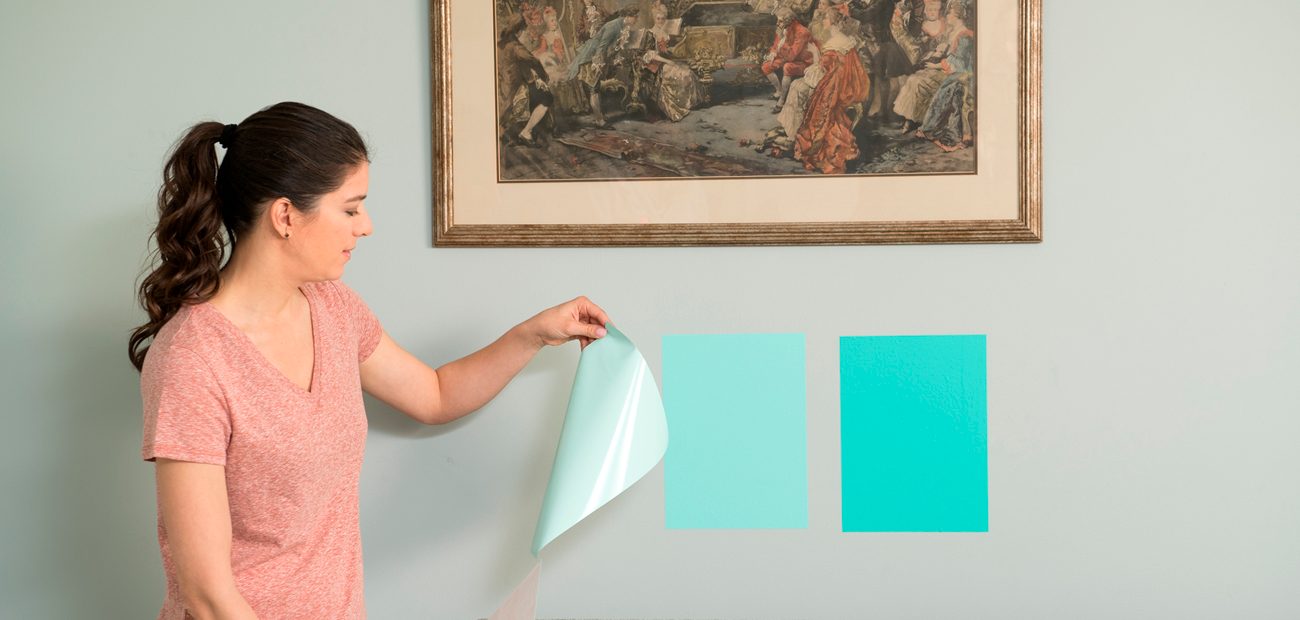
© SureSwatch
But small swatches don’t always provide an accurate gauge. So, some companies now offer large peel and stick swatches that can be applied to the wall and easily be removed. Samplize is a company that offers 8-inch square paint samples with colors from four major manufactures—Sherwin-Williams, Benjamin Moore, Farrow & Ball, and select PPG/Behr hues. Homeowners can buy them online or in several retail locations for $5.95 each. SureSwatch makes paintable 9-by-12-inch clear films that homeowners can paint with their preferred color. Jamie Peltz, who developed the product, says it gives a more accurate color assessment than applying paint on top of another color on the wall. After the paint dries, a homeowner attaches the film to a wall. The adhesive doesn’t cause damage. Packs of three films are available for $2.94 at Home Depot and select hardware stores.


